Windows 11 is here, and you’ll likely be seeing it on the next PC you buy or as a free update to your existing PC next year. And though Microsoft’s latest operating system is functionally very similar to Windows 10, it has undergone quite a drastic visual overhaul and some tricky interface changes.
I tested Windows 11 on a new Surface Go 3, and out of the box setup was exactly as straightforward as you would expect, including interminable explanations of why you really ought to enable each unnecessary data-sharing feature you’re trying to opt out of.

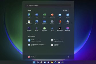
The Windows Start menu is now essentially just an app drawer.
Eventually you’re greeted with the revamped desktop, which blends familiar Windows design with something more akin to Google’s ChromeOS or Apple’s Mac. Menus are very graphic, more information rich and scale their contents to fit resized Windows in a more complex manner. Rounded edges and transparency effects make for a clean and modern look, while choosing or creating a colour theme generally has much more pleasing results than in Windows 10.
Much has been made of the new centred Start menu, which is really just an app drawer now rather than an ever-expanding box of nested directories, but it’s easy to get used to. You can pin your favourites up front, scroll through everything you have, or search. It’s also easy to move the menu back to the left if you like, but I found I didn’t need to.
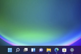
In fact the Start button is now just one of a few key tools on the taskbar that you’ll use to keep track of your workflow, and depending on how you use Windows 10 it might be fairly familiar already. The Search button obviously lets you find documents, settings or web results, while the Desktop button lets you organise your open Windows into groups for easy switching.

The Windows 11 taskbar shows icons for your pinned and open apps, with no option to ungroup or display labels.
Then there’s Widgets, which pulls up a menu on the left hand side that you can customise with glanceable information, Chat which will connect you directly to people in Microsoft Teams, and the good old fashioned File Explorer which has had a nice visual overhaul. It’s now easier to start new documents or pick up where you left off directly from the explorer.
Elsewhere quick settings like audio, Bluetooth and Wi-Fi are now bundled together Apple-style, next to a combined notifications and calendar bar on the bottom right.
The thing that took me longest to adjust to was that the classic Windows option to have fully labelled buttons for each open app on the taskbar is finally gone; you just get a row of icons with indicators underneath to show if an app is open or active. Still, having to hover over the icon to choose which instance of the app you want to jump to isn’t a huge deal, and it does encourage you to get with the times and multitask properly.


