“There weren’t any significant period features, apart from the unique building itself, a rare example of regency revival modernism in Australia,” says Kennedy, whose brief was to reconfigure the floorplan into a one-bedroom apartment with a second space that could be used as a second bedroom or an alternative use.
The other directive was to imbue the apartment with a sense of glamour that would have been evident when the building was completed.
Loading
Kennedy and his team took their design cues from The Peacock Room in London, a lavish interior designed by James McNeil Whistler completed in 1923 – featuring a rich melange of peachy, golden hues and peacock-green walls.
The other source of inspiration came from the work of Australian interior designer, Marion Hall Best, the doyen of the 1960s, known for her reflective and mirror-finished painted ceilings.
“We wanted to capture the richness and texture of that period, while moving forward,” says Kennedy, pointing out the cloth wallpapers and the home’s many travertine finishes – from floors to benchtops.
The apartment now features what’s referred to as the long room – an elongated space that includes the living and dining area with a secondary sitting area, all of which are connected to the generous western terrace, with its enfilade of pillars.
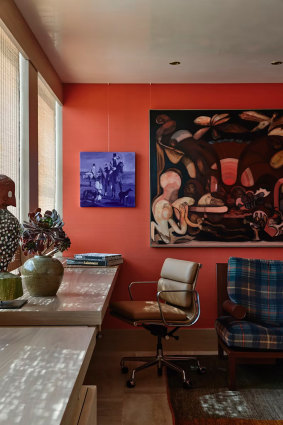
The kitchen and “snug”, or office beyond, forms an L-shape to the plan, with the main bedroom and two bathrooms located at the other end of the apartment. From the living areas, orientated to the Botanic Gardens, the views take in Port Phillip Bay, the Melbourne Cricket Ground, Government House and Melbourne’s skyline.

Kennedy Nolan’s reworking in the Fairlie has won them an architecture award from the Australian Institute of Architects (Victorian Chapter).Credit: Derek Swalwell
“We wanted to ensure these sight lines could be appreciated from within the core of the floorplan,” says Kennedy, retracting the sliding door to the home office/snug/second bedroom.
However, while a guest could theoretically stay over, Kennedy Nolan’s design encapsulates perfectly a configuration tailored to a couple who have an impressive collection of furniture and art – including a photograph by Christian Thompson at the apartment’s entrance and furniture by Warren Platner, who made his indelible mark in the 1960s and ’70s.
Loading
Other pieces include a dining table commissioned from Thomas Lentini and richly embroidered curtains from Pierre Frey for the bedroom, artworks in their own right.
At a time when many of today’s top-end developments appear cookie-cutter, offering a standard (read predictable) range of finishes and fittings, this Fairlie abode celebrates the whimsical and stylish interiors of both the past and, more importantly, the present.
“We have an in-house joke in the office as well as with our clients that there’s an element of the hostess department from the Georges store, meaning a quiet luxury,” adds Kennedy.


