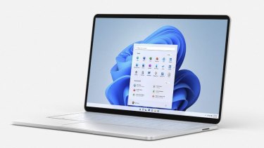
This is the same interface we use on Apple and Android smartphones and tablets, which showcase a tray of important apps at the bottom centre of the screen. Still, it’s a welcome change. The Start button in previous versions of Windows opened a laundry list of apps and settings that felt tedious to scroll through.
The most interesting new design change is a feature called Snap Layouts, which I loved. In the upper-right corner of an app, when you hover your mouse cursor over the maximise-window button, a grid opens up to show different arrangements that automatically shrink down or reposition the app. So if you want to reposition an app window so that it takes up only the left side of the screen, you click on the corresponding icon to snap it into that position. That’s much quicker than moving a window and dragging a corner to the proper size.

Most Windows 10 machines should get a free upgrade to Windows 11 next year.
The Meh
Many additions to Windows 11, including support for Android apps, were designed to keep people in the flow on their machines, said Yusuf Mehdi, a Microsoft executive. When you order an Uber, for instance, you no longer have to pick up an Android phone to summon the car and can do it directly from the Uber app on the Windows machine.
Yet many of the new features didn’t keep me in the flow.
One of them is the ability to create multiple desktop spaces, which Microsoft calls Task Views. The idea is that you can have a desktop screen for each aspect of your life. One desktop could be devoted to work and show shortcuts to your email and calendar apps. Another could be devoted to your personal life and show shortcuts to all your games.
Loading
This all sounds good, but divvying up my life into separate desktop screens quickly felt irksome. Switching to a specific screen and looking for the right app to launch took much more time than using the search tool to quickly find and open an app.
Windows 11 also reintroduces the widget, a concept that Apple and Google operating systems have long used. Widgets are basically a lightweight app that always remains open, like a weather app, a calendar or a stock ticker, so that you can instantly glance at important information. To view widgets, you click a button that shows a drawer of all of them running side by side.
I never got into the habit of using widgets on any of my smartphones or computers because they feel superfluous — and it was the same with Windows 11. Widgets show a bite-size amount of information, like a truncated view of your calendar to show the current date and your next appointment. But whenever I checked my calendar widget, I ended up wanting to open my full calendar app anyway to see all my events for the month.
The Ugly
These are still early days, since Windows 11 is officially due for release in the holiday season and much about the software is subject to change. But one issue that is unlikely to change is that for security reasons, personal computers must, at a minimum, include fairly recent chips from Intel and AMD to install Windows 11.
That means millions of computers running Windows 10 on older hardware, including some that are a few years old, will not be able to run Windows 11. So at some point, those users will have to buy new computers to gain the stronger security benefits and new features in the operating system.
In other words, unlike past updates that have been free, Windows 11 may mean you have to pay for a truck to move into a house that feels quite familiar, with some new window dressing.


 Add Category