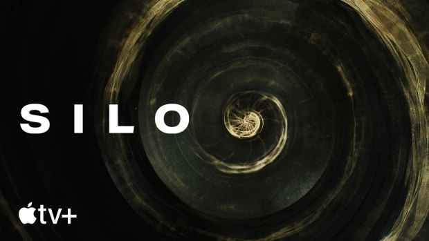
Clair describes the title sequence as “an airlock” between regular life in a show’s world.
“It’s got to be really pretty to watch the first time to get you in the mood,” he says. “But the next time you see the sequence, it’s got to let you drift off and think a bit more deeply about the story.”

An image from the title sequence for Apple TV’s Silo, which is nominated for an Emmy Award this year.Credit: Antibody
Clair thinks Mad Men is the benchmark for title design.
“Every time I work with a new showrunner, I say ‘we can make something that’s a nice wrapping for your show, but if we want to make something that makes it worth it for the viewer to watch it every episode, we need to have something in it that’s really fundamental to your character – that’s as relevant in the pilot as it is in the final episode of the final season’,” he says.
“It will really boil down to one compelling idea. For Mad Men, it’s the image of a man in freefall. And a man in freefall describes Don Draper in every episode of that show.”

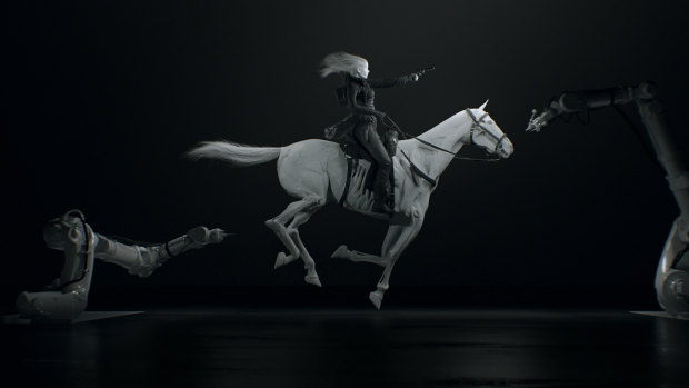
An image from Patrick Clair and Raoul Marks’ Westworld title sequence, which has been nominated in previous years for an Emmy.Credit: Antibody
For 3 Body Problem, the show’s makers showed Clair and Marks a short documentary that zoomed from an atomic level up through a picnic to show the whole universe.
“They said this was something they liked as a reference so we immediately thought that doing an exponential zoom would be interesting,” Clair says.
Out of that grew the idea of showing the transition from Earth to its nearest star.
Loading
“We started thinking about all the different ways you can see the universe that’s not through human eyes – what if you could see electricity, what if you could see gravity, what if you could see how a proton looked?,” he says.
Title sequences are less relevant in film, except for franchises like the James Bond and Marvel series.
“I think title sequences work fundamentally when they’re part of a format, they’re part of something that you return to,” Clair says.
“It’s very hard to make something worthwhile for something very singular like a feature film. It’s really more the domain of series to have a compelling title sequence that serves the story.”


 Add Category