It’s no surprise that Google’s apps are especially well adapted to the fold, with the likes of YouTube and the Play Store making more effective use of space on the Pixel versus the Samsung, but it also feels like Google just has more of a handle on how to design for a foldable in general. Wherever possible, the Pixel treats the large display as two regular phone screens — which feels natural and adds to the interplay between the inner and outer screens — whereas the Galaxy will default to stretching content across the entire width. A clear example is when you swipe down from the top of the screen; on Pixel, you get notifications on the right and quick settings on the left, whereas on Samsung, it’s the familiar One UI control panel made wide.
App shape
When it comes to apps not made by Google, you’re at the mercy of Android and app developers to make it all work. Many apps are flexible and will make it work, while some will stick to an aspect ratio they know (such as 3:2 or 16:9), and you’ll get some empty black space. But once again, I found the overall experience less clunky on the Pixel, both because there’s a setting to force apps to a ratio of your choosing and because the displays are more logically sized.

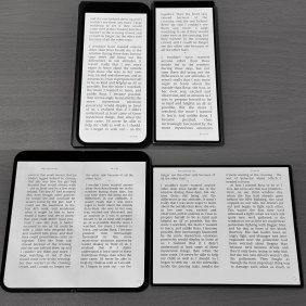
The same ebook on Pixel 9 Pro Fold (left) and Galaxy Z Fold6 (right).Credit: Tim Biggs
For example, when reading an ebook on the Kobo app, it was easy to get a good screen layout, whether opened or closed on either device, but they both had their own quirks. When closed, the Galaxy made for a tall and thin page that felt a bit cramped, while the Pixel felt more natural. When opened, the Galaxy strangely only allowed a two-page layout when the device was rotated to landscape mode, forcing comically wide single lines otherwise. The Pixel allowed you to choose either layout in either orientation. I was able to fit slightly more text on the screen at the same size on the Galaxy since it hides its selfie camera under the display while the Pixel forces a black strip across the top, but having the fold cut across the text on the Galaxy was annoying.
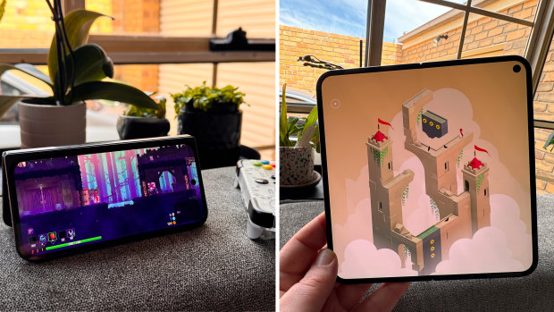
Games are an interesting prospect on foldy phones because they tend to like very predictable screen shapes. And while the Pixel Fold 9 Pro doesn’t have a fix for wanting to play staunchly 16:9 games (like those you might be streaming from a PC or console) on the square internal screen, you can fold it half open like a little tent to play those games with a controller.
When you open it up, most mobile games adapt really well to the square display, especially if they’ve been designed primarily with touchscreens in mind. For games designed for controllers, I wish there was a system-wide option to put a widescreen window up top and a virtual controller down below. As it stands, you have to rely on each game developer to implement a customisable touch control solution, and I’ve only seen a handful that do it perfectly.

Square is a kooky shape for traditional games, but it works well for those made with tablets in mind.Credit: Tim Biggs
Streaming video is preferable on the Pixel compared to other folding phones, again, because the shape of the screen cuts down on the black bars you’ll see, but a square isn’t the most cinematic shape, and we’ll probably be waiting until phones can fold over twice before we solve that problem. Some shows and movies are perfectly watchable with the sides cropped off, but I prefer to either watch on the cover screen or stack apps one on top of the other, with maybe a full-screen video up top and messaging below. You can also save your favourite pairs of apps to the home screen so you can open both at once.
Loading
Under the hood, the folding Pixel is very similar to the Pixel 9 Pro XL, including all of Google’s latest AI features, however some sacrifices were made to get it as thin as it is. The only one I really felt was in the cameras; it still has macro, ultra-wide and a 5x zoom lens, but it produces noisier results if you’re not out in bright conditions.
Of course, folding phones are not for everyone, and for the small group of people who want one, I imagine some people are going to prefer Samsung’s; it’s sharp and futuristic, while the Pixel is rounded and bubbly, it works with a stylus, and it will feel familiar if you’ve always used Samsung phones. But for me, the Galaxy Z Fold has always felt like a bit of a sideways step from a regular phone, with some benefits and some drawbacks. The Pixel, meanwhile, feels like a natural extension.
Get news and reviews on technology, gadgets and gaming in our Technology newsletter every Friday. Sign up here.


 Add Category